
førm
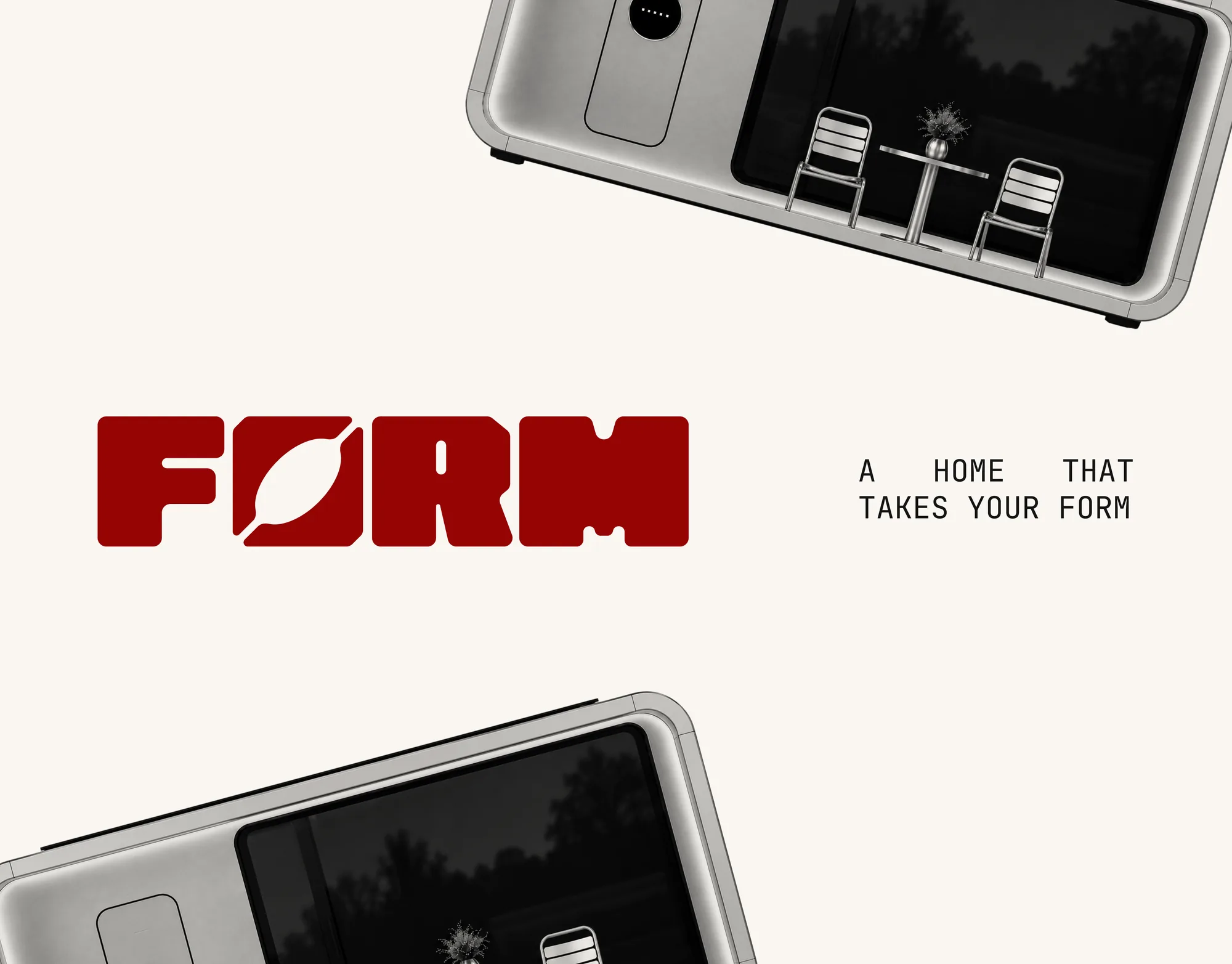
Brand identity for modular autonomous homes
#task
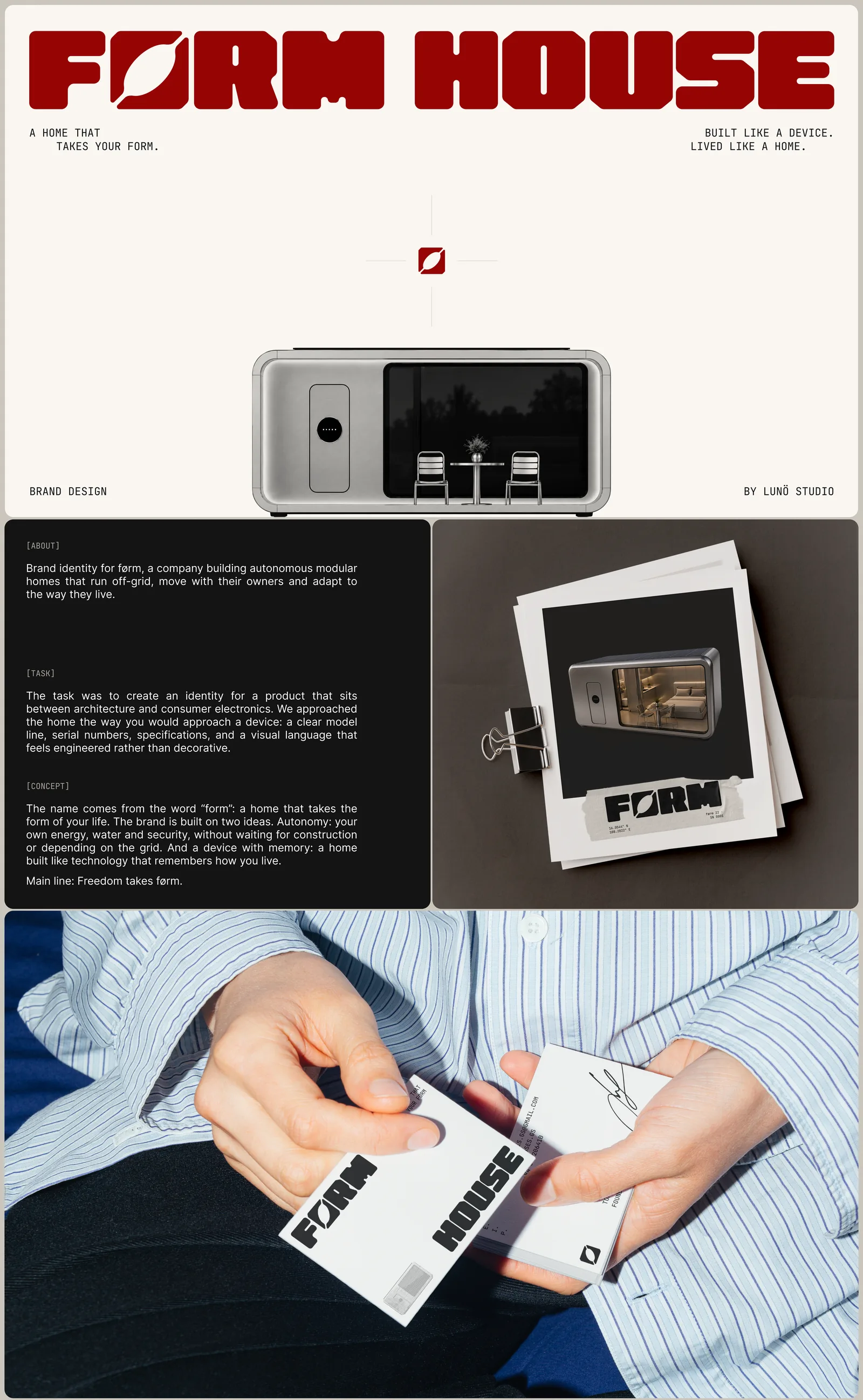
førm is a company building autonomous modular homes that run off-grid, move with their owners and adapt to the way they live
We created an identity for a product that sits between architecture and consumer electronics
We approached the home the way you would approach a device: a clear model line, serial numbers, specifications and a visual language that feels engineered rather than decorative
#concept
The name comes from the word “form”: a home that takes the form of your life
The brand is built on two ideas
Autonomy: your own energy, water and security, without waiting for construction or depending on the grid
A device with memory: a home built like technology that remembers how you live
Main line: Freedom takes førm
#logo
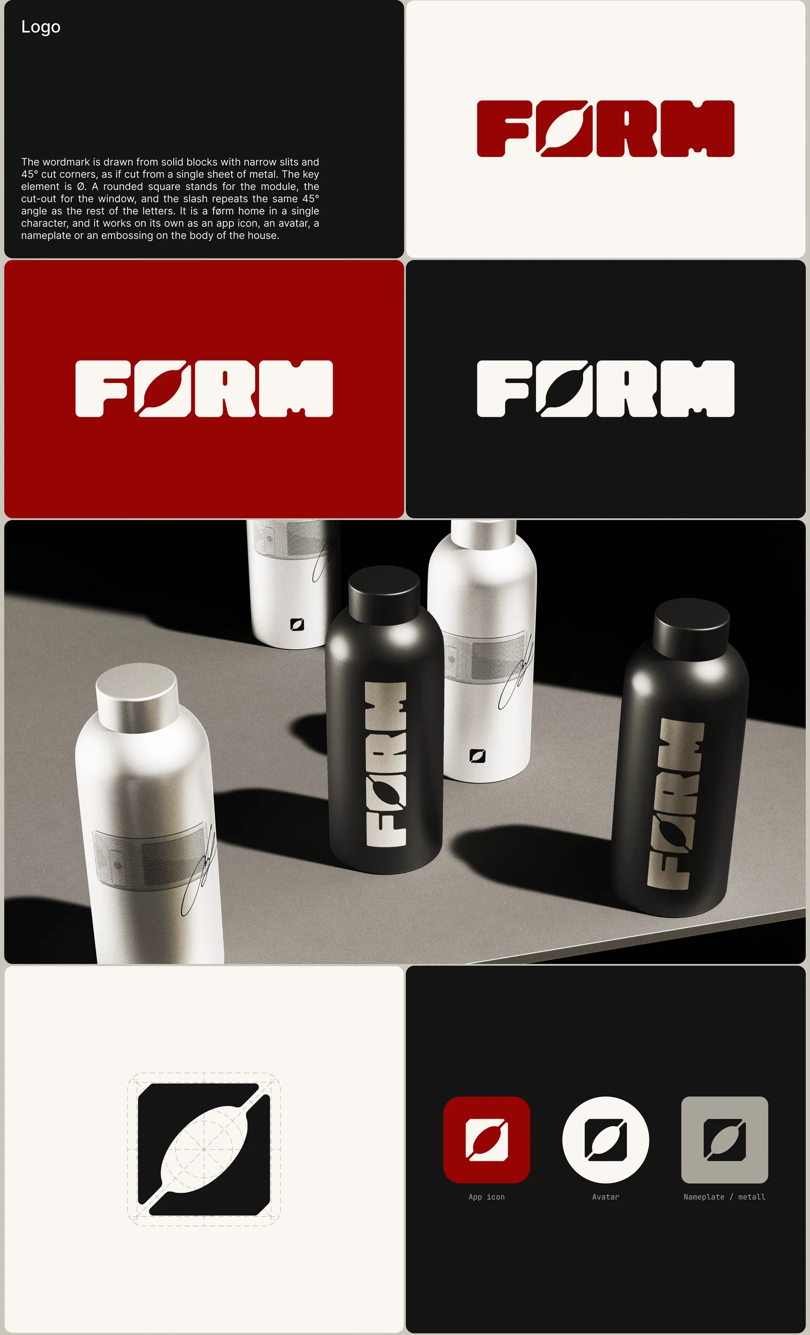
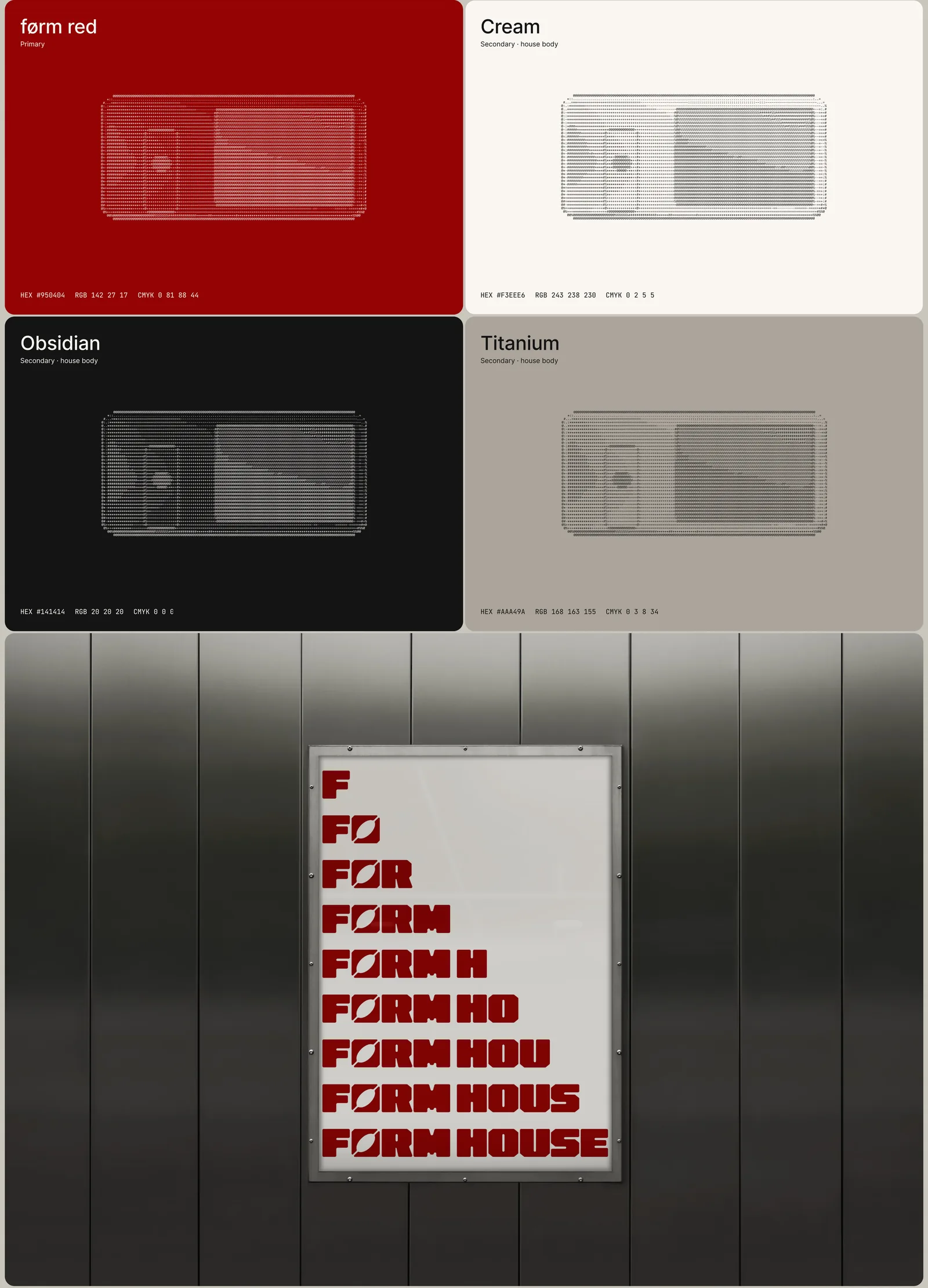
The wordmark is drawn from solid blocks with narrow slits and 45° cut corners, as if cut from a single sheet of metal
The key element is Ø: a rounded square stands for the module, the cut-out for the window, and the slash repeats the same 45° angle as the rest of the letters
It is a førm home in a single character, and it works on its own as an app icon, an avatar, a nameplate or an embossing on the body of the house
#identity
- Colors førm red as the one bold accent, with cream, obsidian and titanium as calm supporting tones
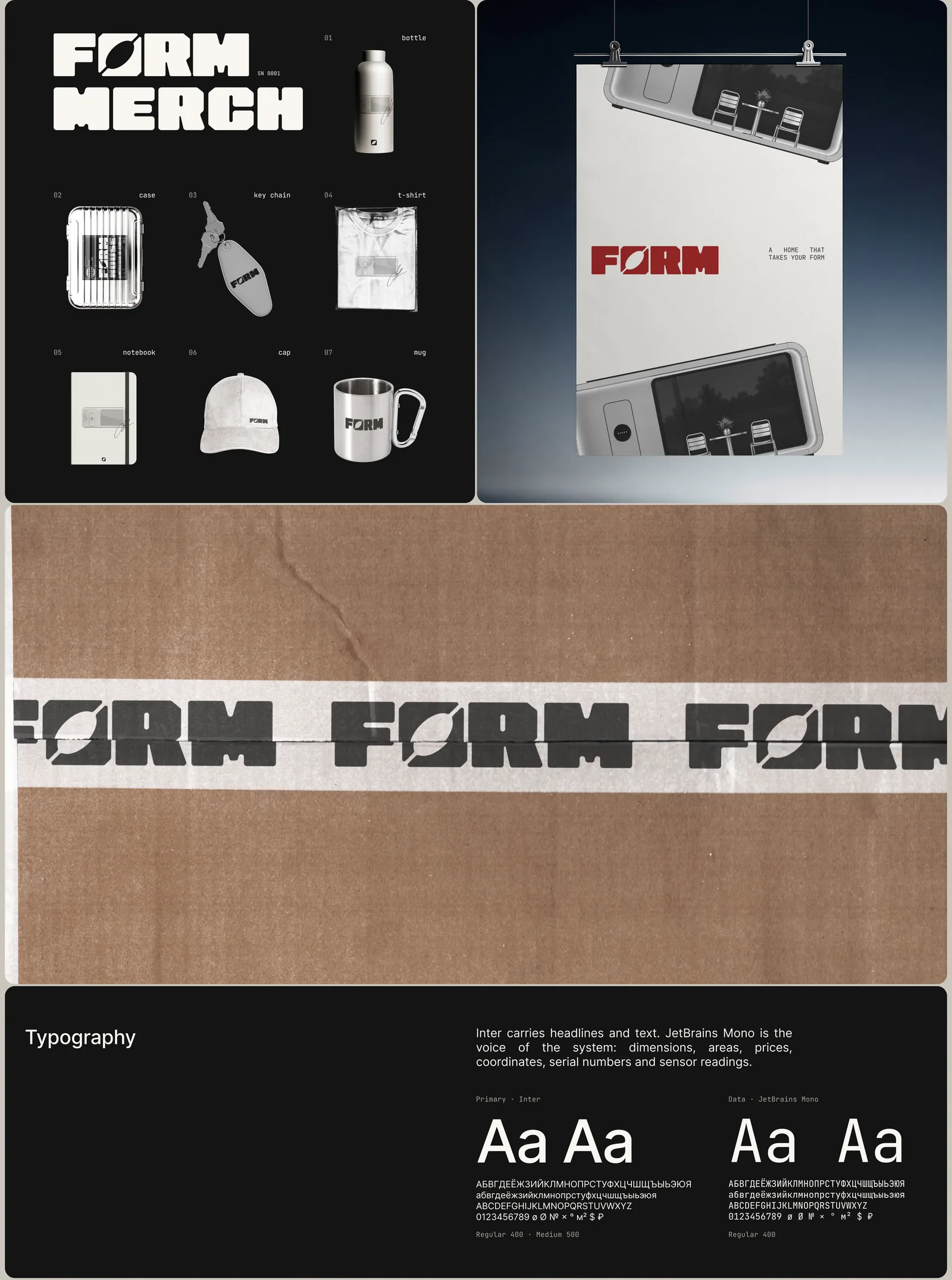
- Typography Inter carries headlines and text, JetBrains Mono is the voice of the system: dimensions, prices, coordinates, serial numbers and sensor readings
- Icons A set of solid geometric icons in the character of the wordmark
- Graphics ASCII-style textures of the home itself, used on color cards and covers
#what we delivered
- Name and brand idea
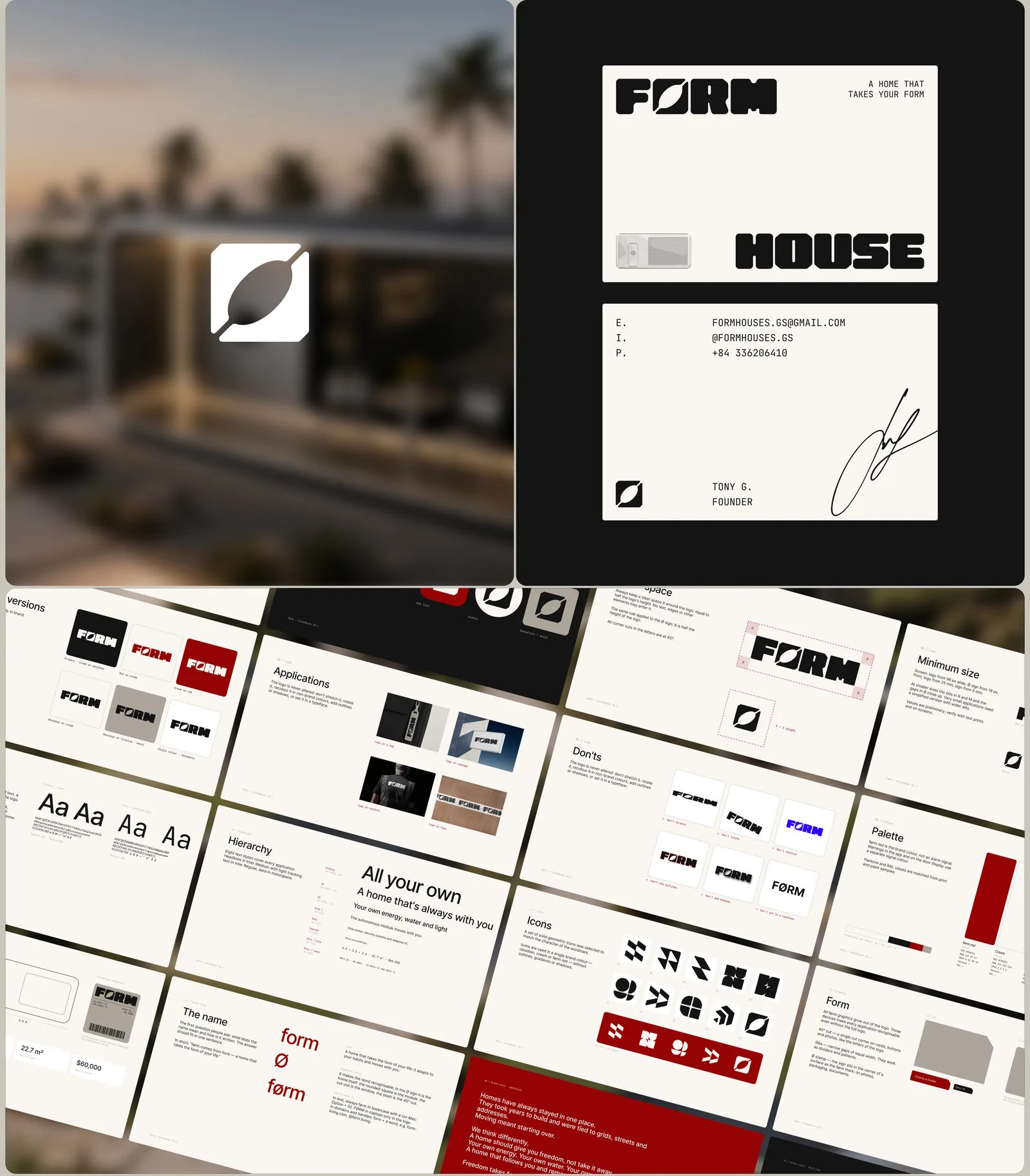
- Logo, logo versions and clear-space rules
- Color palette, typography and icon set
- Brand book with rules and examples
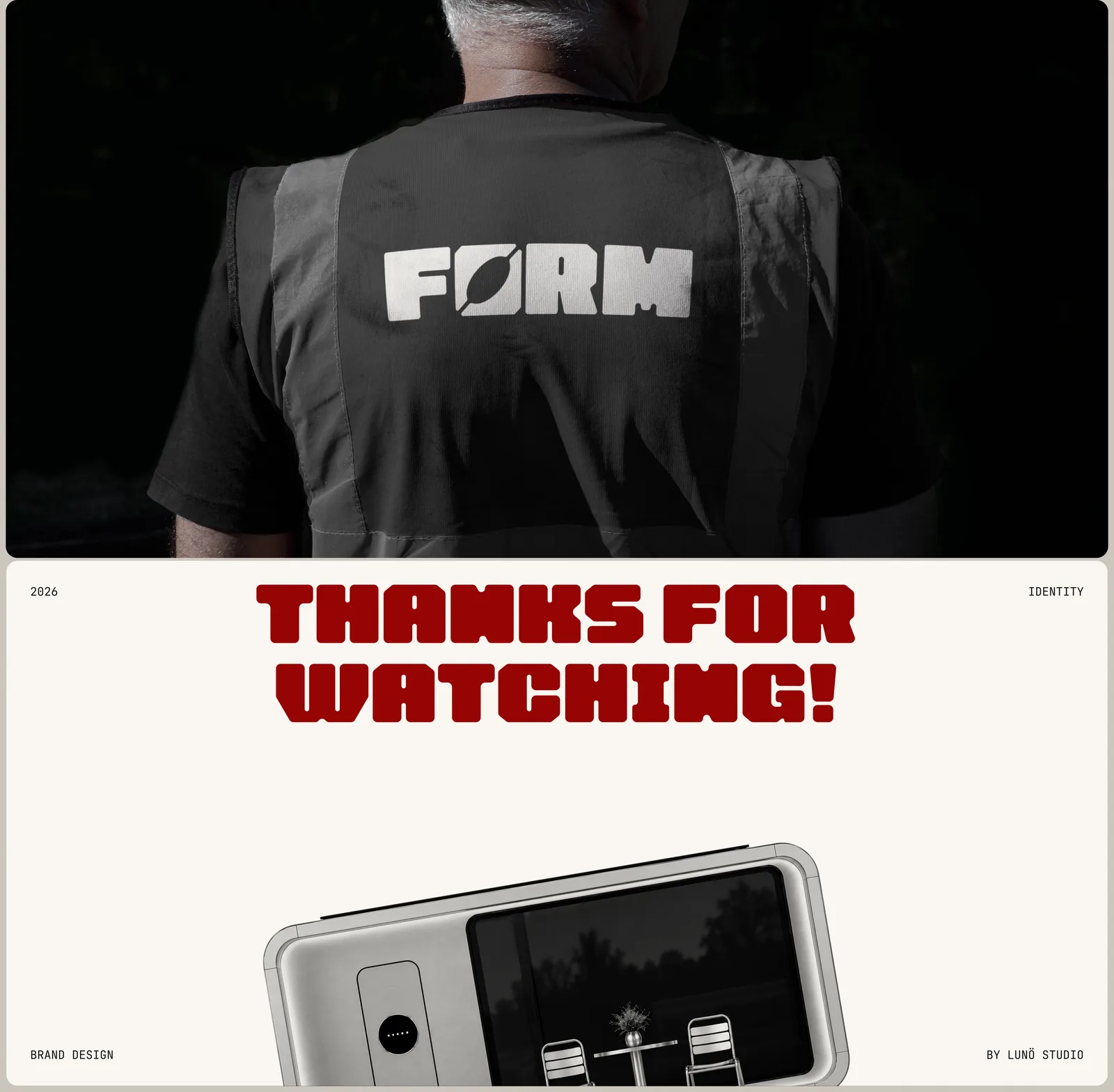
- Applications: poster, business cards, merch, packaging tape, signage and work vest
want the same for your brand?
discuss a project#other cases
 Beeyawn#corporate
 Project 54#corporate
 Midas#corporate
 ORTA#corporate